


Oakridge
The Living City
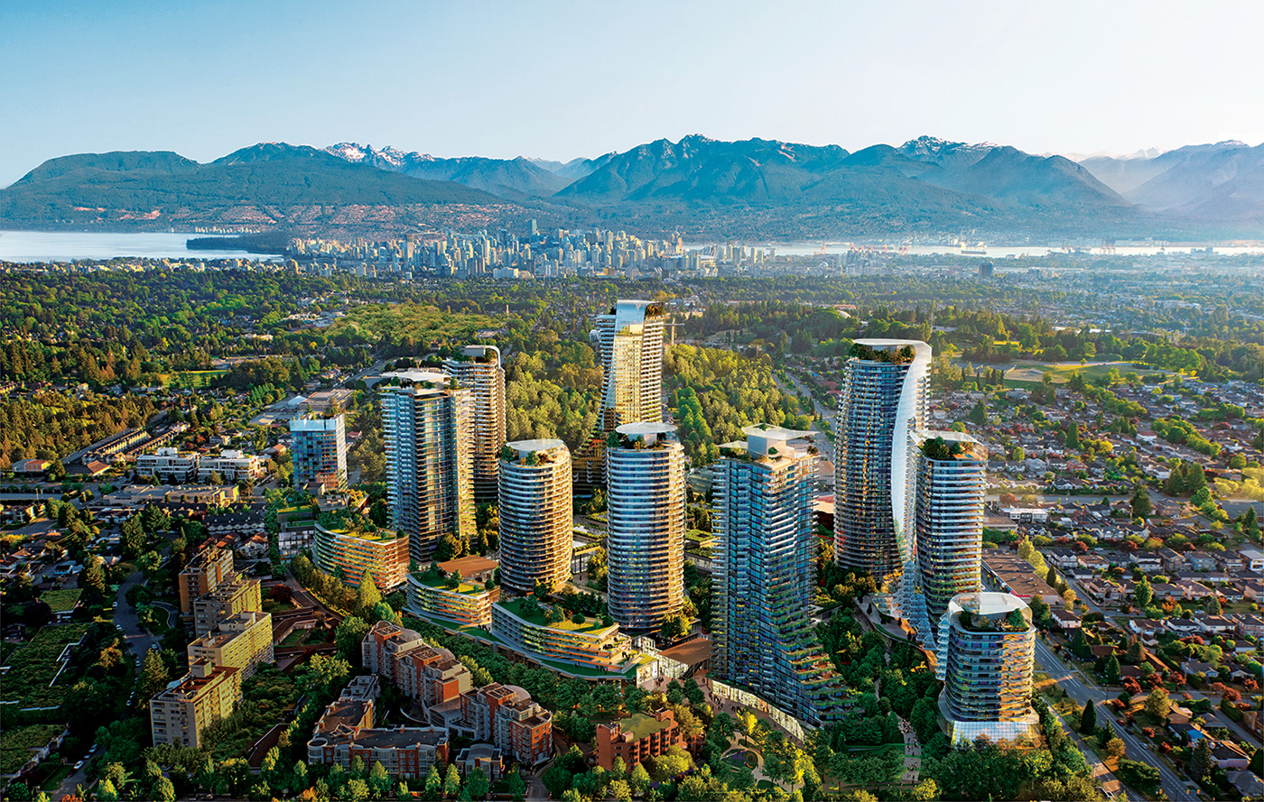
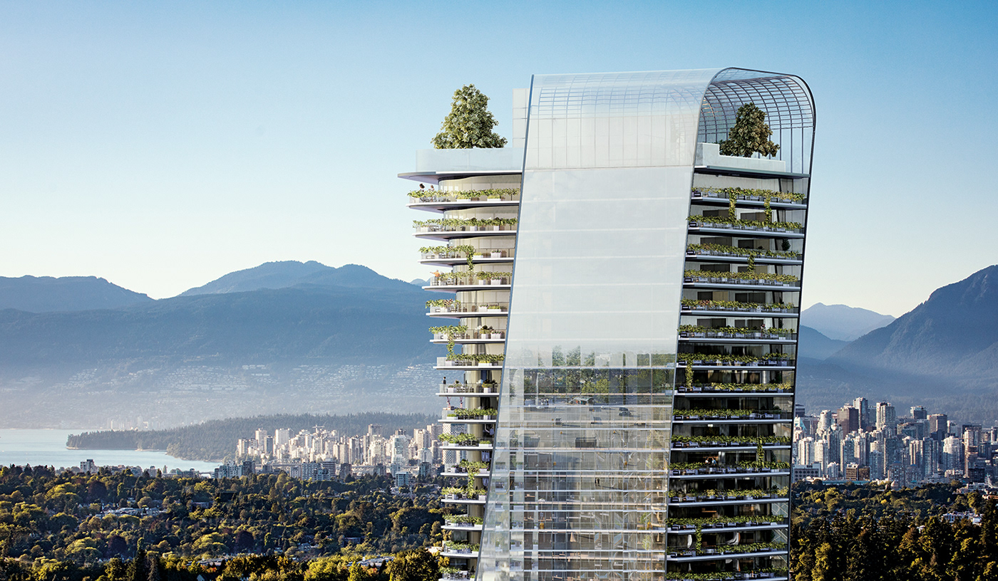
With the complete makeover of Vancouver’s iconic Oakridge shopping centre and surrounding area, luxury real estate developer Westbank embarks on its most ambitious project yet. In a metropolis characterised by a unique symbiosis between nature and culture, Oakridge organically unites these two apparent opposites in a single urban district. From this insight the ‘The Living City’ brand positioning was born, representing both the natural and social aspects that make a city come to life: its natural environment, its people and their stories. Oakridge offers a truly holistic approach to modern city living. It’s a testament to the ability of man and nature to adapt and live together as one.
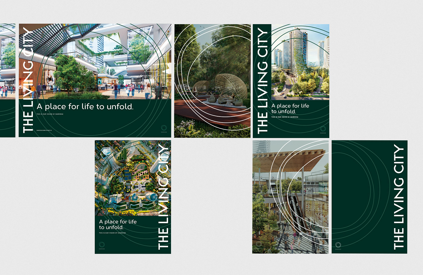
The brand expressed itself through a series of books, several campaign layers and a large-scale exhibition showcasing the future of urban culture.
Collaborating with AKQA, we've been responsible for the design of the Oakridge brand identity and its implementation across its various layers.


What is a city?
Great cities are random. Open. Serendipitous.
Formed by accident and sagacity.
They facilitate a search, not a solution.
Great cities are intuitive and natural.
They grow organically and flexibly.
They extend and elaborate on their networks,
Rather than imposing their structures on communities.
Great cities are in a constant state of flux.
They thrive on oppositions as the building blocks of dynamic cultures.
More than anything, they co-opt differences to instigate change.
But all of these are also inherent characteristics of nature.
Nature, which has always been thought of in tension with the development and expansion of cities & culture.
At Oakridge, every moment, every person and every place is naturally merged into a one-time only experience. It is alive because it celebrates nature as an integral part of lifestyle.
Human stories, ideas and dreams. All connected to the same ecosystem. Without them, our cities are lifeless.
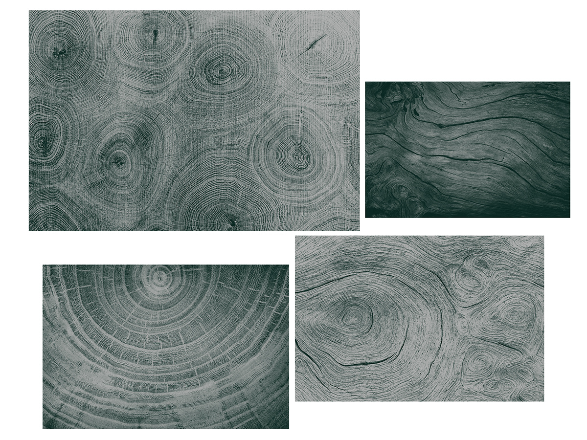
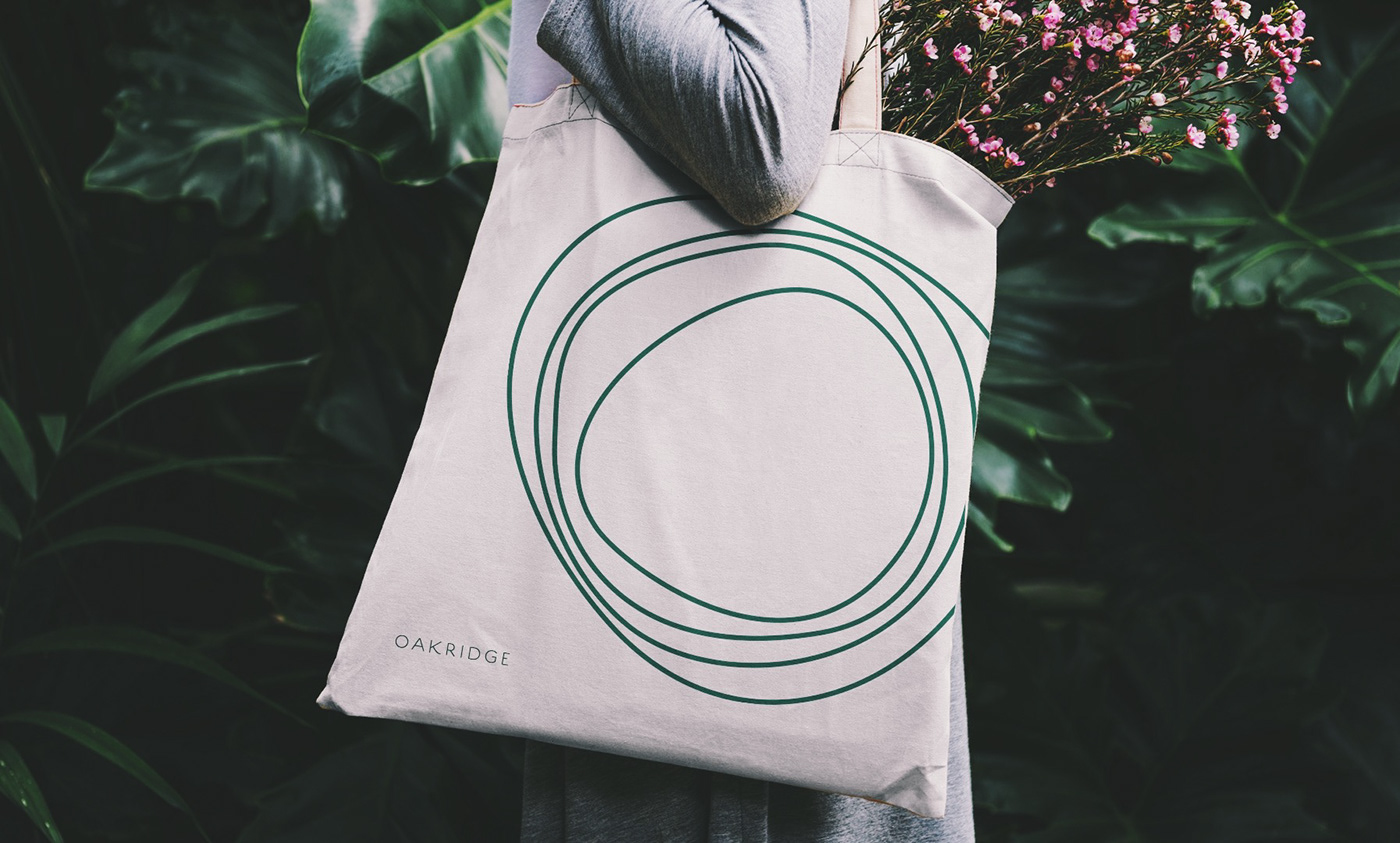
The logo is based on three components.
It started from the idea of Oakridge as a cultural hub. An epicentre for ideas, knowledge and arts.
The we took the natural aspect from the Oakridge name itself — the rings of an oak tree.
Thirdly, there's the combination of residential, commercial and communal aspects, symbolised by the circles that touch and overlap.


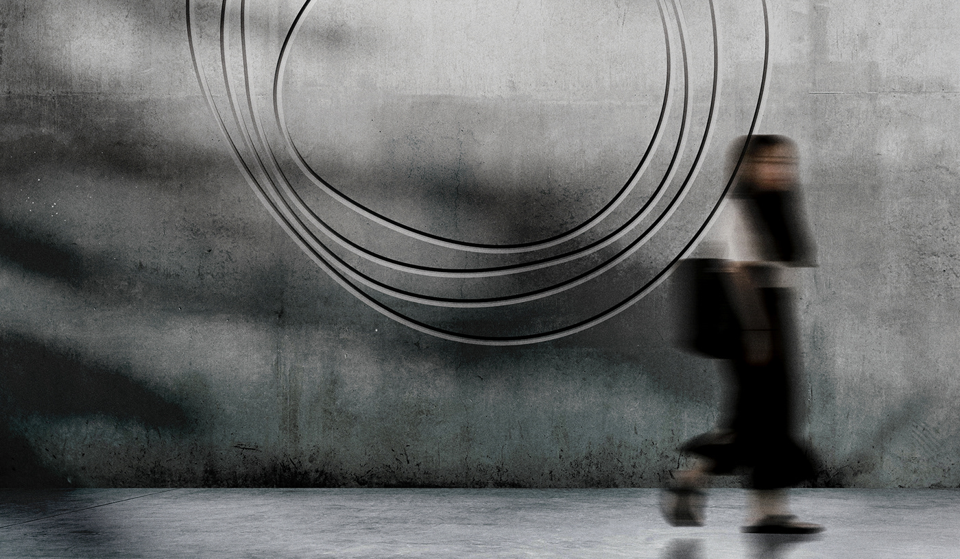
A Living Logo.
The branding reflects Oakridge’s dynamic and ever-evolving nature, manifesting itself through a dynamic identity inspired by the fundamental characteristics of nature: organic, dynamic, mutable, adaptable and ever evolving. A living logo.
Its dynamic nature allows the logo to adapt to a vastitude of scenarios, collaborations, events and special occasions that require the logo to express a different personality, while remaining itself.


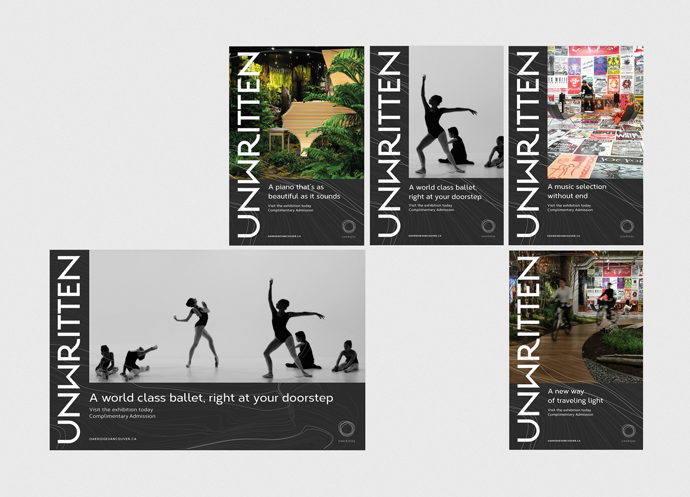
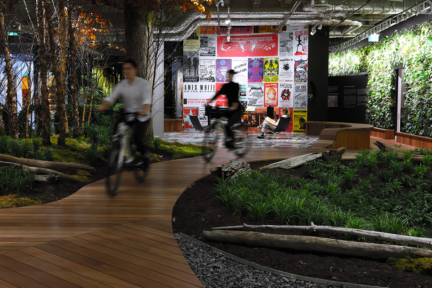
Unwritten Exhibition: Launch Event
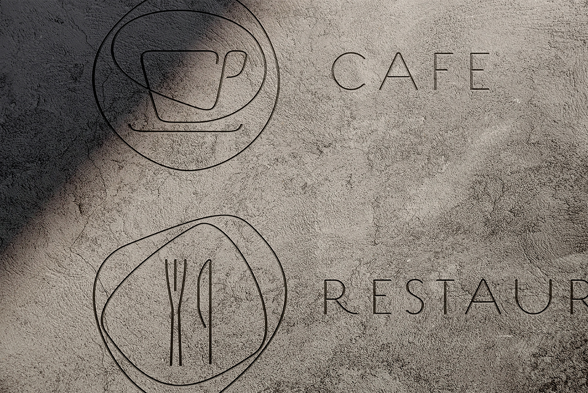
The Oakridge branding was first released to the public on the "Unwritten" exhibition, in Vancouver, showcasing the future of urban culture and the thoughts, dreams and ideas behind the Living City, displayed through its different expressions of fashion, music, architecture, wellness, mobility and much more.
The dynamic nature of the Oakridge brand had its first opportunity to be applied to a different scenario, for this exhibition we applied a monochromatic colour scheme to the brand in order to let the green of the vegetation act as the brand colours, making the brand live as an empty canvas which would be filled with the surrounding elements.


Agency: AKQA Tokyo
Design Direction & Design: OnRepeat Studio
Creative Direction: Axel Van Weel / OnRepeat Studio
Copywriting: Axel Van Weel
Design Direction & Design: OnRepeat Studio
Creative Direction: Axel Van Weel / OnRepeat Studio
Copywriting: Axel Van Weel


